
ESTICY
WHAT I DID
THE BRIEF/GOAL
ROLE: Content Designer/UX Writer
-
User research
-
Content audit
-
Competitor research
-
UX Design (Mobile)
I re-wrote the mobile web content by improving structure and flow and using clear, persuasive language, we can quickly educate users giving them full control over their budget and booking progress. This approach reduces drop-off rates and keeps users engaged when browsing travel and tour options.
-
Microcopy
-
Content design for USP

DESIGN PROCESS
OVERVIEW
Picture this—you’re a travel enthusiast who wants the ease of booking a vacation without the hassle of finding the cheapest flights, a comfortable or luxurious hotel, and meaningful activities.
In most travel apps, a common issue is overwhelming information and visual clutter, which often frustrates users. Many end up piecing together random deals like hotels that are too far from the airport or tours they have to organize themselves.
What if travel users could see everything in one place? Flight options, hotels, tours all presented clearly, along with a way to earn rewards (not referrals) simply by going on vacation.
Could this all be organized in a safe, transparent way—free from distracting ads and overpriced hotels that only add to the confusion?
HYPOTHESES
By improving the website’s content structure and flow and using clear, persuasive language, we can quickly educate users—giving them full control over their budget and booking progress. This approach reduces drop-off rates and keeps users engaged when browsing travel and tour options.
After collecting some insights from several respondents, it was found that the basic problem was in the content structure and insufficient guide language when using the Esticy website. Whilst the colours are friendly and relaxing, the language doesn’t prompt users to do anything else
IMPLEMENTATION
During the research phase, I used two methods—Pros & Cons analysis and desktop research—to find issues with Esticy’s content structure and presentation. I also did online user surveys before updating the content to learn what language users prefer when making travel decisions. The main goal was to check how well users interact with the new copy compared to the old version.
The solution was to create clear, easy-to-understand copy that fits Esticy’s brand tone and encourages users to sign up and book travel deals. We focused on improving the content flow on the home page and sub-pages, making information easier to find and use.
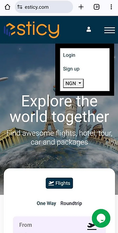
BEFORE IMPROVEMENT

AFTER IMPROVEMENT
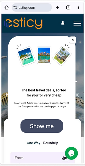
Added a pop-up screen on the homepage showing an overview of what the website is about.

Added a second screen next to Flights allowing for users to toggle between options and select their preference.

Improved the copy of the sign in/register screen by introducing a drop down that is a pop-up, allowing users decide when they’re ready.
Added Google, Email, Apple, Facebook Sign in/ Regsiter options.

Results
-
A/B testing showed that 80% of users preferred being able to see flight options, including the option to select the number of travelers.
-
Users also liked having suggested in-season destinations, which saves them time on research and decision-making .This feature is expected to reduce dropouts from the website and make it easier and more flexible for users to choose a travel destination.